

The impact of personal characteristics and industry on graduate earnings
David Kernohan is Deputy Editor of Wonkhe
Tags
I’ve gone over the unlikely history and thwarted purposes of LEO elsewhere, and I’m sure I’ve covered the caveats around interpretation (part time work is really badly handled!) more than enough times to not need to repeat them here.
But I wanted a moment to demonstrate some of the externalities that contribute to graduate salaries (and graduate destinations) beyond subject and provider choice.
To start with, the impact of the state of an industry. There are some areas of the economy that don’t pay graduates well, despite relying heavily on graduate skills. Popular examples would include most of the public sector, and the arts and creative industries.
This plot allows you to see the salary differentials by destination depending on the particular role a graduate takes, and you can filter by subject area The size of the blobs shows the number of graduates that take that route, and the columns allow you to see the state of play one, three, five, and ten years after graduation (YAG). There’s filters by qualification level (if you are interested in postgraduate stuff) and sex.

This isn’t provider level data (the sample sizes would be too small) but it is very easy to understand the pressure on providers to focus students on high paying roles – and thus the likely squeeze on subjects that tend to lead elsewhere.
But graduates have actively chosen their subject and provider, so if we see this dataset as a means to drive applicant behaviour (which could, conceivably be a government intention) it’s difficult to complain too much about what we see above.
Generally speaking, graduates have not chosen their sex. Neither have they chosen their ethnicity, family background, or previous educational experiences. They may have chosen their current region of residence, but often this is constrained by resources and responsibilities that are not under personal control.
It’s clear from this chart that these things have a huge impact on graduate salaries (and, for that matter, graduate destinations).
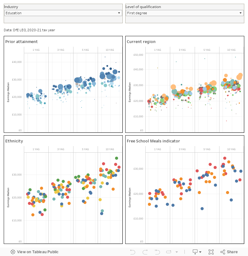
Here, the two filters at the top (broad industry area and level of qualification) work on each of the four charts. For prior attainment and current region, the size of the blobs represent the number of graduates in each narrow industry area (for ethnicity and free school meals, the plots are clearer with equal size dots due to the dominance of White students, and students with no FSM – on the latter, “not known” usually means a private school student).
I’ve used automatic highlighters to help you see the differentials within narrow industry areas for each chart – just mouse over a dot of interest and you’ll see comparable dots highlighted. For ease of presentation I’ve omitted the colour legends – hopefully you’ll get the idea of what is going on as you explore (but it’s worth knowing that for prior attainment the darker the blog the higher the attainment, and BTECs are greenish rather than pure blue).
What we see here is evidence of an impact of each of these factors on what graduates earn, and even what job they do. In most sectors ethnicity is the least striking of the four – but recall there will be intersections with prior attainment. Attainment will also intersect with free school meals. And the predominance of the (tan coloured) large London blobs will demonstrate that for all the rhetoric of levelling up you have to move to the big city to earn more – though, you will of course spend more in living there.
So here we’ve used LEO to demonstrate the wider impacts that graduates experience beyond their choice of provider, subject, and industry. And we see how much of the graduate employment experience varies based on personal characteristics rather than university achievements.