Update March 2023: The Savings Evidence Map is no longer available in the form outlined below. It is now available as a download here.
The Savings Evidence Map was launched in 2018 as part of the Savings Learning Lab activities. The first annual update just added 37 new resources on evidence, bringing the total number of studies included in the map to 299. The overall distribution and characteristics of the evidence have not significantly changed since the first mapping. Studies documenting client level results continue to dominate and evidence at the ecosystem level is sparse. This leads us to conclude that research continues to focus on the related topics and that the evidence gaps remain wide and unfilled.
Nevertheless, a thorough consultation process with experts in the field and our partners, we can see that people are using it to consult the available evidence.
What is the Savings Evidence Map?
It is a one-stop-shop for relevant and reliable evidence on a broad range of savings initiatives, including ones related to savings groups, individual savings, formal and informal savings.
If you Google the impact of savings on low-income women, you get over 100 million search results.
Well, fear not! If you are interested in the most recent and reliable evidence on savings-focused financial inclusion initiatives, we’ve done all the searching and sifting for you. The Savings Evidence Map provides consolidated access to relevant evidence, enables users to navigate the existing evidence, as well as identify gaps and additional opportunities for research and programming. The evidence included in the map builds on four learning questions of the Savings Learning Lab:
- Impact: does financial access substantially improve the well-being of customers?
- Client: which financial services and channels are most valued by the financially disadvantaged?
- Institutions: what drives the business case for providers to serve the financially disadvantaged?
- Ecosystem: what does an enabling environment look like and what is the appropriate role for funders to play in supporting it?
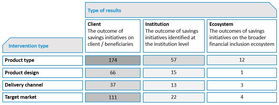
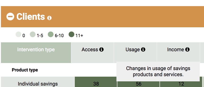
Furthermore, the map organizes the evidence into a matrix structure – by type of results (see figure 1) grouped into client, institutions and ecosystem-level results, and by the type of savings intervention documented in the evidence, such as interventions focused on product type, product design, product distribution channels and target markets. The figures in each cell indicate the number of studies in the respective category. It is important to note that several studies document multiple types of results so if users are tempted to do the math the total will add up to more than 299.
What Can We Immediately Glean from the Map? A Few Fun Facts:
- Already mentioned but worth reiterating, client level results dominate the map, while the least amount of evidence is found at the ecosystem level. 30 of the newly added studies document results related to customers such as changes in access and usage of savings services, changes in income, assets, and consumption. Significantly fewer studies (and only 11 of the newly added ones) document evidence related to institutions, mostly examining the sustainability and replicability of savings groups initiatives, as well as the effectiveness of their business model. Except for a small number of studies, with only two of the newly added ones documenting results related to policy and regulation, reliable evidence is almost non-existent at the ecosystem level.
- More than half of the studies adopted a quantitative approach (54% of the total sample of included studies); this holds true especially for client and institution level results
- Moving from the client through the institution and ecosystem-level results, the proportion of studies that fully meet all quality criteria reduces while the proportion of relatively low-quality studies increase
- Examining our sample of studies (excluding systematic reviews, research syntheses, EGMs and literature reviews) by geographic focus, we find the majority of studies focus on Sub-Saharan Africa (172), followed by South Asia (62) and Latin America and the Caribbean (34).
How Do I Interact with the Map?
The map is intended for practitioners looking for evidence of what works (and what doesn’t) to help inform decisions on savings programming and policies. It is intended for donors and investors interested in making evidence-based, strategic investments in this area, and for researchers interested in filling the evidence gaps.
The map is designed to be user-friendly and was informed by an extensive consultation process, indicating that there existed a demand for evidence consolidation among practitioners involved in savings programming. There was also interest for the evidence to be categorized by type of results achieved, type of savings intervention, research methods and level of results achieved.
We invite users to explore the evidence included in the map and access the studies they are interested to learn more about by clicking, hovering, sorting, and generally poking around the map.
In addition, the consultation process also uncovered a demand for deep-dives and synthesis of evidence. In response, we’ve taken a sub-section of the map that looks at outcomes for savings for youth and we invite others to dig deeper into other areas and let us know what you find.
The map is updated annually with newly available evidence that meets a set of inclusion criteria. The next update is scheduled in early 2020. In the meantime, please let us know if you have any questions or know of studies that you think should be added to the map.
Interested in Learning More?
The online map is hosted on the Mango Tree, an initiative of the SEEP Network.
A synthesis report and a summary report are also available for download.
This blog was initially published on the SEEP leading collaboration and learning blog.
