
I recently finished Seveneves by science fiction author and telecom enthusiast Neal Stephenson.
This book tells the story of near-future humanity struggling to survive after the moon explodes and threatens to end all life on Earth. The scientific and military elite game out their way forward, running models to identify scenarios with the highest probability of survival.
This brings me to wide area networking.
Over the course of several blog posts, I want to discuss using hypothetical WANs to “wargame,” as Stephenson would say. What that means is that I want to illustrate how different network configurations might affect total cost of ownership (TCO). To do this well, we actually need to build a hypothetical network. So that's what we did. Today, I'm going to walk you through what we've built.
First: Why Are We Doing This?
Now, I’d hope that IT infrastructure management is not as serious to you as saving Earth’s genetic diversity is to the characters in Seveneves. Nonetheless, choosing the right WAN solution for a multinational corporation represents millions of IT dollars. That’s a lot of pressure!
But the right data can help make those multi-million dollar decisions easier.
Our analysis has often focused on comparing prices across geography, capacity, and time, but this level of analysis misses the meat: how they apply to real networks.
For more than a decade TeleGeography has collected prices for various corporate network components and released those prices as searchable databases. Our analysis has often focused on comparing prices across geography, capacity, and time, but this level of analysis misses the meat: how they apply to real networks.
This is where network wargaming (and this blog series) comes in, and why we created a hypothetical WAN to test the many configurations that are possible in a modern SD-WAN enabled network.
About Our Hypothetical WAN
The goal was to create a hypothetical WAN that reflected the reality that IT infrastructure managers are facing. I based our hypothetical network on our median WAN Cost Benchmark customer and used input from our 2018 WAN Manager Survey that queried IT infrastructure managers from around the world about their network configurations.
The resulting hypothetical network is 150 sites spread across major international business centers.
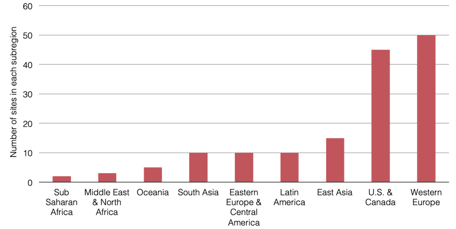
Because most of our customers and survey respondents are located in the U.S. and Western Europe, our network is heavier on sites in those locations. Nearly two-thirds of sites are in those regions, with the remaining third spread across Latin America, Africa, the Middle East, and Asia-Pacific. This screenshot of a map from our benchmark tool gives a clear picture of how our hypothetical network is distributed and the chart provides actual numbers of sites in each subregion.
Where Are Our Sites?
WAN Cost Benchmark Network Map
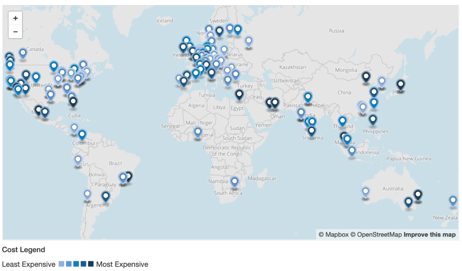
A U.S. and Western Europe-Heavy Spread
Hypothetical Network Site Count by Subregion
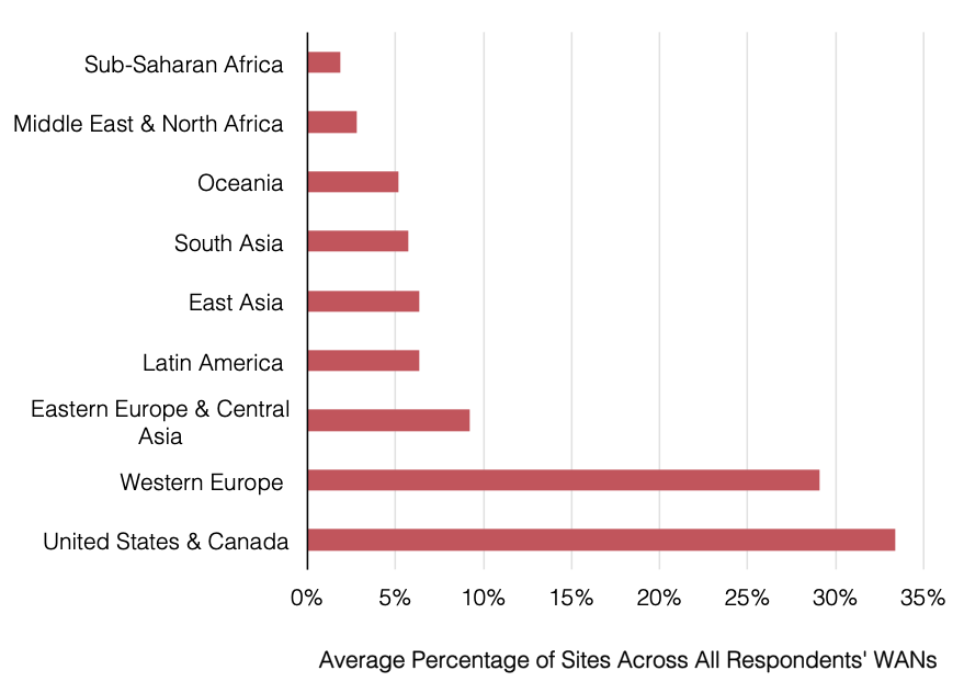
Though primarily based on our benchmark customers, this geographic distribution matches pretty well with the networks of our 2018 WAN Manager Survey respondents.
Survey Respondents Had Most Sites in U.S. & Canada
2018 WAN Manager Survey Average Percent of Sites in Each Subregion
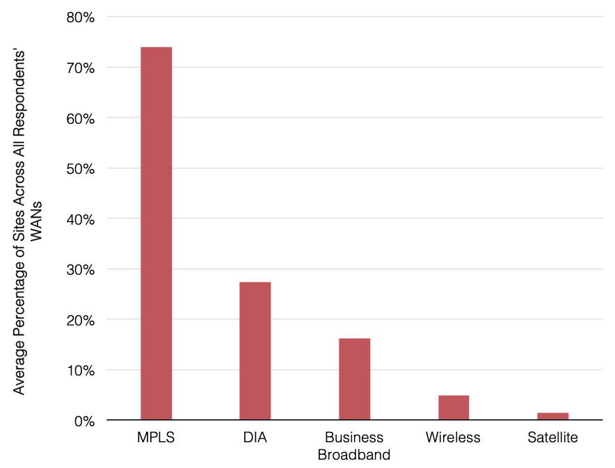
The 150 site network is running MPLS VPNs at 140 sites, DIA at 25, and business broadband at 15. So, 10 sites have no MPLS, and a few sites already have internet in addition to MPLS. This is fairly similar to the average product mix of our 2018 survey respondents that showed about three-quarters of sites running MPLS and one quarter running DIA.
I set MPLS class of service (CoS) levels to 10% voice/video, 30% real-time data, and 60% best efforts, which is typical of our customers’ average sites. These are also the values we use when benchmark customers cannot specify actual CoS levels.
Survey Respondents Still Lean on MPLS
2018 WAN Manager Survey Average Product Mix Across WAN Sites
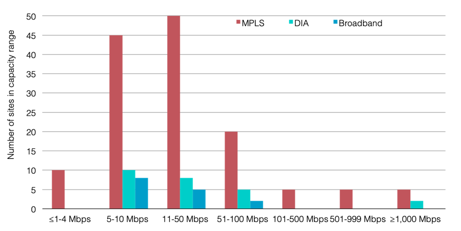
The most typical port/circuit speeds are in the 11-50 Mbps range, with the majority of ports in that range at 20 Mbps specifically. The next largest group is 5-10 Mbps. There are a few small capacity sites at 4 Mbps or below, often in very expensive markets, and a few very large capacity sites, meant to represent headquarters and data centers. The average total available bandwidth (including any sites with two active network products added together) across all sites is 125 Mbps of active available capacity. Most sites have much less bandwidth, but the average is brought up by the very large sites with 500-1,000 Mbps.
Our Network Put Most MPLS Sites in 11-50 Mbps or 5-10 Mbps Ranges
Original MPLS WAN Site Capacity Range
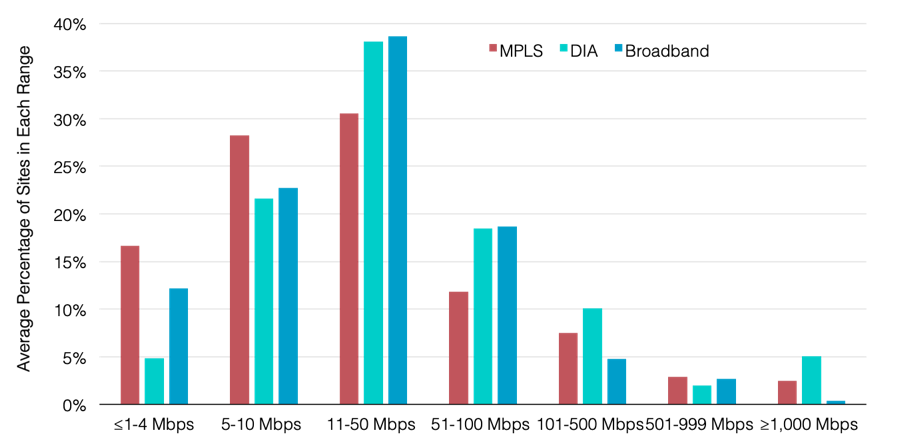
Again, this tracks fairly well with our 2018 WAN Manager Survey that showed most MPLS sites in the 11-50 Mbps or 5-10 Mbps ranges and very few at 100 Mbps or especially 1,000 Mbps.
This Mirrors Our Survey Respondents
2018 WAN Manager Survey Average Percentage of MPLS, DIA, and Broadband Bandwidth Ranges at Global Sites
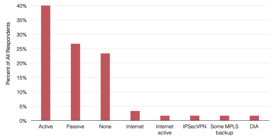
While our survey respondents tended to favor active MPLS backups, our benchmark customers often opted to use passive MPLS backups. The way this is often set up is that the customer pays full price for an additional access line and a discounted price for the passive MPLS port. So the hypothetical network includes dual access lines of the same capacity for each MPLS site both at full charge, even though only one of them gets counted as “active” capacity in the total site bandwidth count.
I also included a second passive MPLS port charged at 50% of the median MRC (again, this is the value we usually assume in a benchmark unless the customer specifies otherwise).
Survey Respondents Favored Active MPLS Backups
2018 WAN Manager Survey MPLS Backup Strategies
Finally, since I was creating this network, I could make it a little easier on myself and assume the corporate footprint was made of mostly urban sites. Our local access pricing data is segmented into distance bands that represent the line of sight distance between the customer site and the carrier PoP. The majority of access lines are in the 0-5 km distance band representing the central business district, though I did include many in the 6-15 km range as well for inner suburban offices. To provide some diversity, I included a couple of dozen sites in the ≥16km access ranges to represent remote offices or field sites. (I never did come up with an industry profile for my fake network here, so you can imagine what type of business this network is engaged in however you like).
Now we can get to some actual analysis.
In the coming weeks, my goal will be to look at the current cost of this WAN and see how those numbers change when we shift technologies, bandwidth sizes, management levels, and other parameters. (Don’t worry. I’ll provide a link back to this full network rundown in all my future analysis. And I’ll henceforth refer to this network as “Original MPLS WAN” in all of these posts.)
Until then, I guess it’s back to saving life on Earth for me—or maybe just some corporate IT spend.
Next up:
- Adopting Local Internet Breakouts in an MPLS-DIA Hybrid WAN
- Wargaming Your WAN: MPLS-Broadband Edition
- Adding SD-WAN, Keeping MPLS
- How to do SD-WAN Without Totally Losing MPLS
- What Happens When You Leave MPLS Behind?
- Aggregator Broadband & SD-WAN
- SD-WAN Management Costs, Wargamed


Greg Bryan
Greg is Senior Manager, Enterprise Research at TeleGeography. He's spent the last decade and a half at TeleGeography developing many of our pricing products and reports about enterprise networks. He is a frequent speaker at conferences about corporate wide area networks and enterprise telecom services. He also hosts our podcast, TeleGeography Explains the Internet.